
The impact of color on human psychology, behavior, and perception is well-documented and recognized. When strategically applied, color can significantly influence the atmosphere, ambiance, and overall look of a commercial space. As a business owner in Sarasota, considering color psychology when planning your commercial property’s interior or exterior painting projects can help you create a more pleasing environment, enhance your brand image, encourage productivity, and even influence the mood and purchasing decisions of your clientele.
In this comprehensive and informative blog article, we will explore the principles of color psychology and their practical applications when selecting the perfect paint colors for your Sarasota commercial space. We will delve into the significance of various colors and their potential effects on employees, customers, and overall brand image, as well as offer valuable tips for harmoniously combining colors to create inviting and purposeful spaces. By harnessing the power of color psychology, you can optimize and elevate your commercial property, making it a more enjoyable and productive space for all who visit and work there.
Colors and Their Psychological Impact on Customers and Employees
Understanding the psychological effects of various colors is crucial when selecting paint hues for your Sarasota commercial space. Here’s an overview of common color associations that can help you create the desired atmosphere and brand image:
1. Red: Associated with energy and excitement, red can stimulate appetite, evoke strong emotions, and grab attention – making it a popular choice for restaurants and retail spaces.
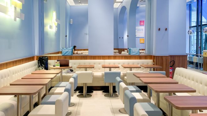
2. Blue: Conveying feelings of calmness, stability, and trustworthiness, blue is an excellent choice for offices and professional settings where focus, productivity, and reliability are paramount.
3. Green: Symbolizing nature, health, and tranquility, green can create a relaxed and soothing environment, making it suitable for wellness centers, yoga studios, or eco-friendly businesses.
4. Yellow: Representing happiness, optimism, and creativity, yellow can evoke a positive and cheerful atmosphere, ideal for innovation-driven workspaces or service-oriented businesses.
Color Combinations and Creating Visual Harmony
Creating visually harmonious spaces in your commercial property involves selecting color combinations that not only complement each other but also align with your desired atmosphere and brand image. Consider these tips:
1. Monochromatic schemes: Create a cohesive and elegant look by selecting various shades, tints, or tones of the same color, offering a sense of unity and consistency throughout the space.
2. Analogous color schemes: Choose colors that are adjacent to one another on the color wheel, providing a harmonious yet visually stimulating environment.
3. Contrast and balance: For a bold and engaging ambiance, utilize contrasting colors (e.g., complementary or split-complementary schemes), but be mindful of the balance to ensure the space remains aesthetically pleasing and not overwhelming.
4. Neutral colors: Incorporate neutral hues like gray, beige, or white to create sophisticated and versatile backdrops, allowing more vibrant colors or branded elements to take center stage.
Brand Identity and the Role of Color in Commercial Spaces
A strong brand identity is essential for establishing a connection with your customers and differentiating your business from competitors. Integrate color psychology and your brand’s visual identity into your commercial space with these strategies:
1. Color consistency: Use your brand’s signature colors in your commercial space to create a unified and consistent visual identity, reinforcing brand recognition and familiarity.
2. Logo and signage: Enhance your commercial space by incorporating your brand’s logos and signage in strategic locations, reinforcing your brand identity while providing necessary information and direction for customers or clients.
3. Branded accent colors: Utilize accent colors that complement your primary brand colors, adding visual interest and depth without detracting from your overall brand identity.
Considerations for Various Types of Sarasota Commercial Spaces
Different commercial spaces call for distinct color and design approaches to cater to the needs and preferences of customers or employees. Here are some ideas for various types of Sarasota commercial properties:
1. Restaurants: Opt for warm and inviting colors like red or orange to stimulate appetite and encourage a welcoming ambiance.
2. Offices: Choose calming and productivity-inducing colors like blue and green, with neutral backdrops and splashes of energizing hues (e.g., yellow or orange) to boost creative thinking and motivation.
3. Retail stores: Create visually engaging spaces with bold and contrasting colors, showcasing merchandise and inspiring customer interest.
4. Healthcare facilities: Prioritize soothing and reassuring colors like soft greens, blues, or neutrals to promote a sense of calmness and healing for patients and visitors.
Conclusion
Color psychology plays a significant role in shaping the atmosphere, functionality, and brand identity of your Sarasota commercial space. Harnessing the power of color can help create a positive work environment, boost employee productivity, and influence clients or customers in a manner that aligns with your business objectives. By understanding the psychological impact of different colors, creating visually harmonious color combinations, incorporating your brand identity, and catering to the unique needs of various commercial spaces, you can transform your property into a more inviting, efficient, and purposeful environment.
When you’re ready to revitalize your Sarasota commercial space with expert painting services, let the skilled professionals at Braendel Painting, Inc. turn your vision into a vibrant reality. Contact Braendel Painting, Inc. today to start your journey toward a well-designed, aesthetically pleasing, and successful commercial space that showcases the power of color psychology.